Image - Result of dUCk Image Ratio refinement
Enhancing shopping experience for dUCk - Research for PDP image ratio
Role
UI Designer, UX Designer
Timeline
October 2022
Product & Platform
dUCk is one of the sub-products of FashionValet (Malaysia). dUCk is known for offering modest clothing ranging from scarfs, abayas, and accessories, presenting them with elegant contemporary art. This product has a commitment to always improve product quality, patterns, and prints that are very diverse.
Fashionvalet also has another sub-product, LILIT. However, unlike dUCk which targets the international market and high-end customers, LILIT. is presented at a cheaper price than dUCk. While working at Fashionvalet, I also got the opportunity to manage LILIT.


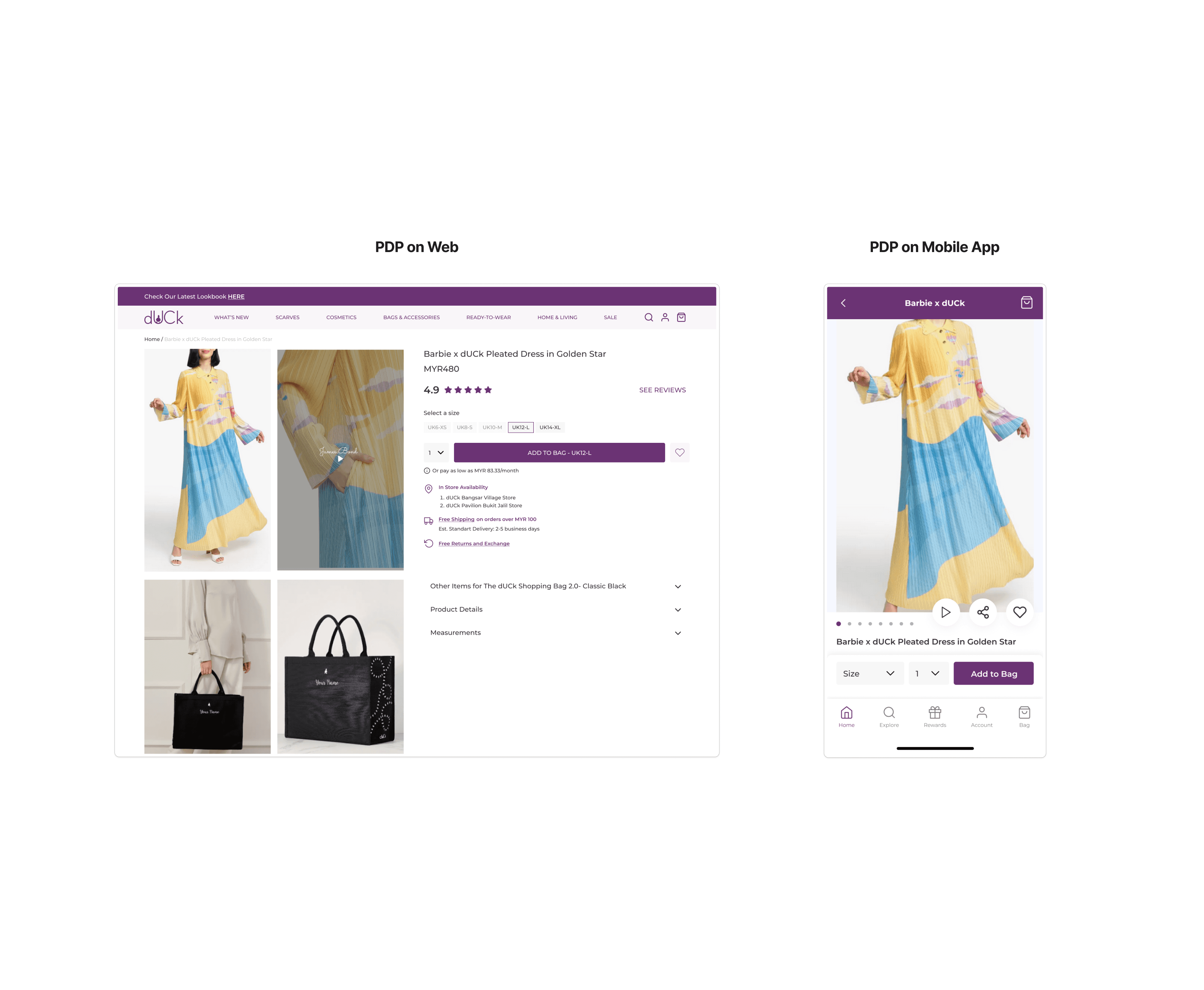
Image - duCk PDP on Web (Left) and Mobile (Right)
The Problems
Since the first release of the dUCk application on the App Store and Play Store, there has been a problem in the PDP (Product Detail Page) section where the application system does not maximize the appearance of images. This happened due to the lack of communication between the Content and Engineering teams, and we from the Product team took the initiative to conduct research on how product photos should be displayed.
Project Goal
How might we implement an image ratio that can be used in mobile apps and web?
In conducting this research, we considered if the appearance of product photos could be implemented not only in the mobile app but also on the web.
Methodology
Competitor Research
We do research on competitors and similar industries.
The Research
Competitor Research
We took screenshots of every mobile app and web. For mobile we use an iPhone XS device, because when designing on mobile devices we use the resolution size for iPhone XS (375x812px). And for web, we use 1440x1024px.
We conducted research into 8 ecommerce competitors and the like, such as: Sephora, Buttonscarves, H&M, Pomelo, POPLOOK, Bonobos, Shein, and Uniqlo.


Image - Result of competitor research
Image Results
After taking sample screenshots, we then measured the resolution of each app. Here are the results
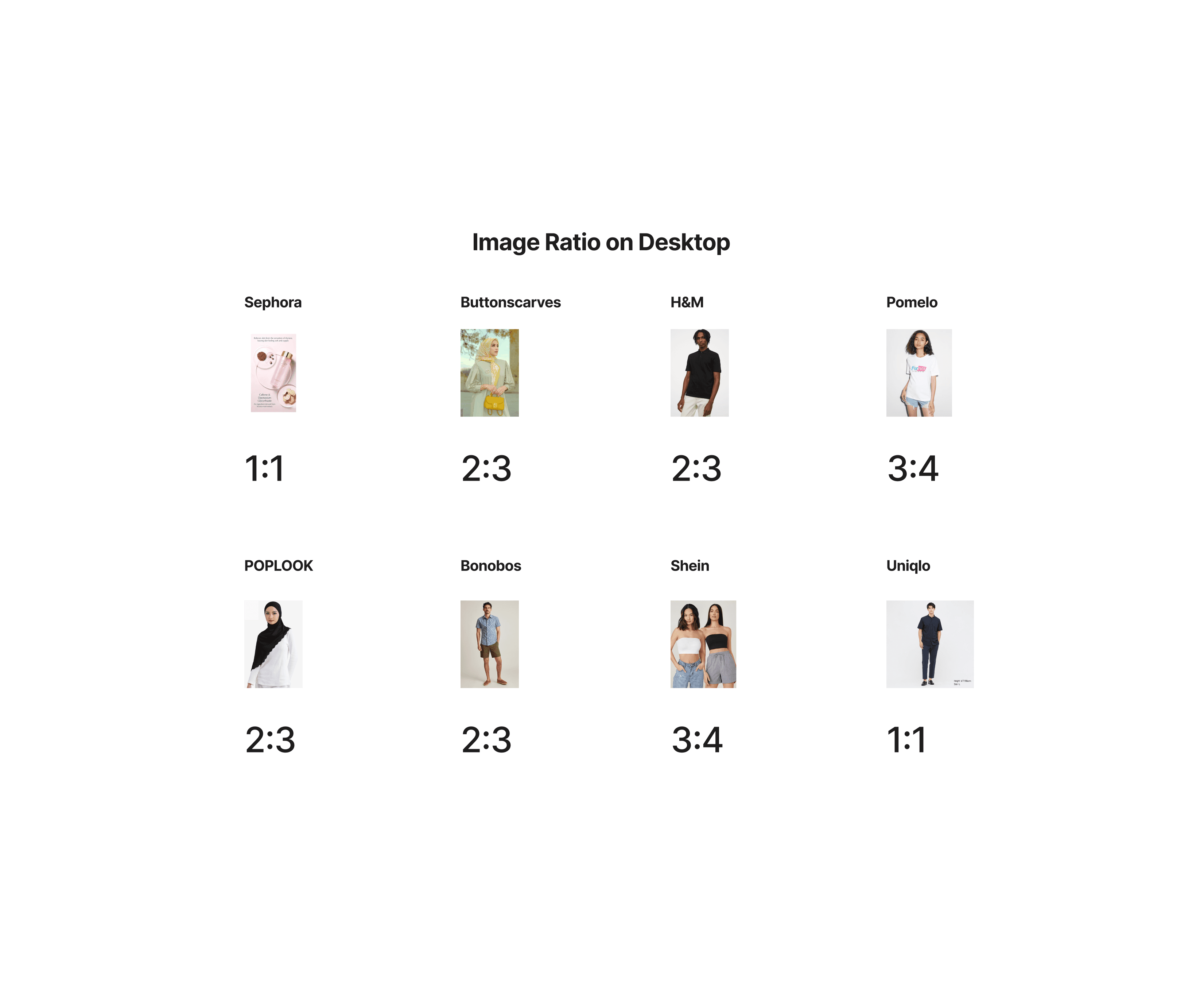
Image - Image Ratio on desktop results
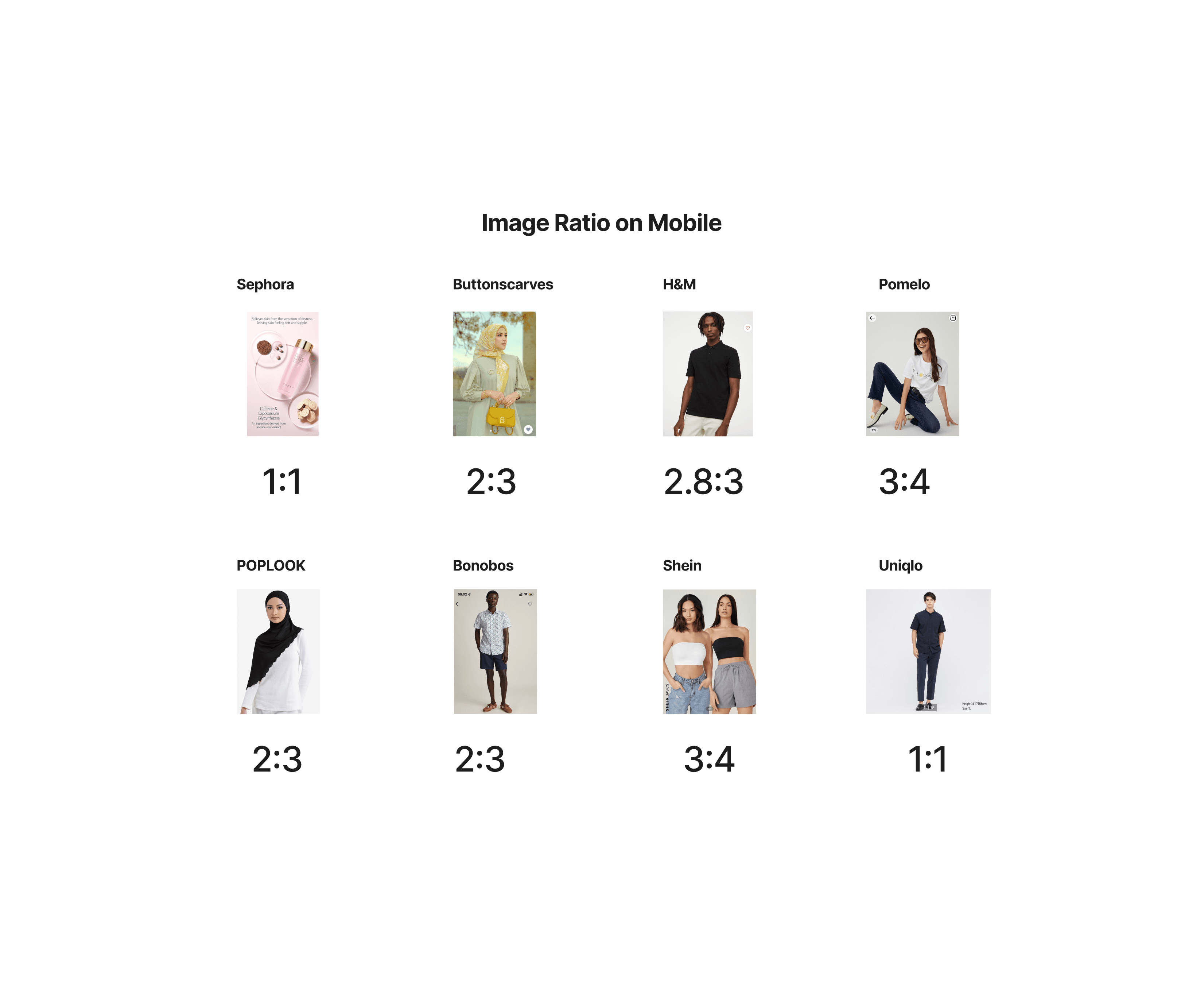
Image - Image Ratio on mobile results
After researching 8 similar ecommerce sites, we found that only 1 (H&M) of the 8 sites changed the resolution from Web to Mobile, while the other 7 sites kept the same resolution on both web and mobile.
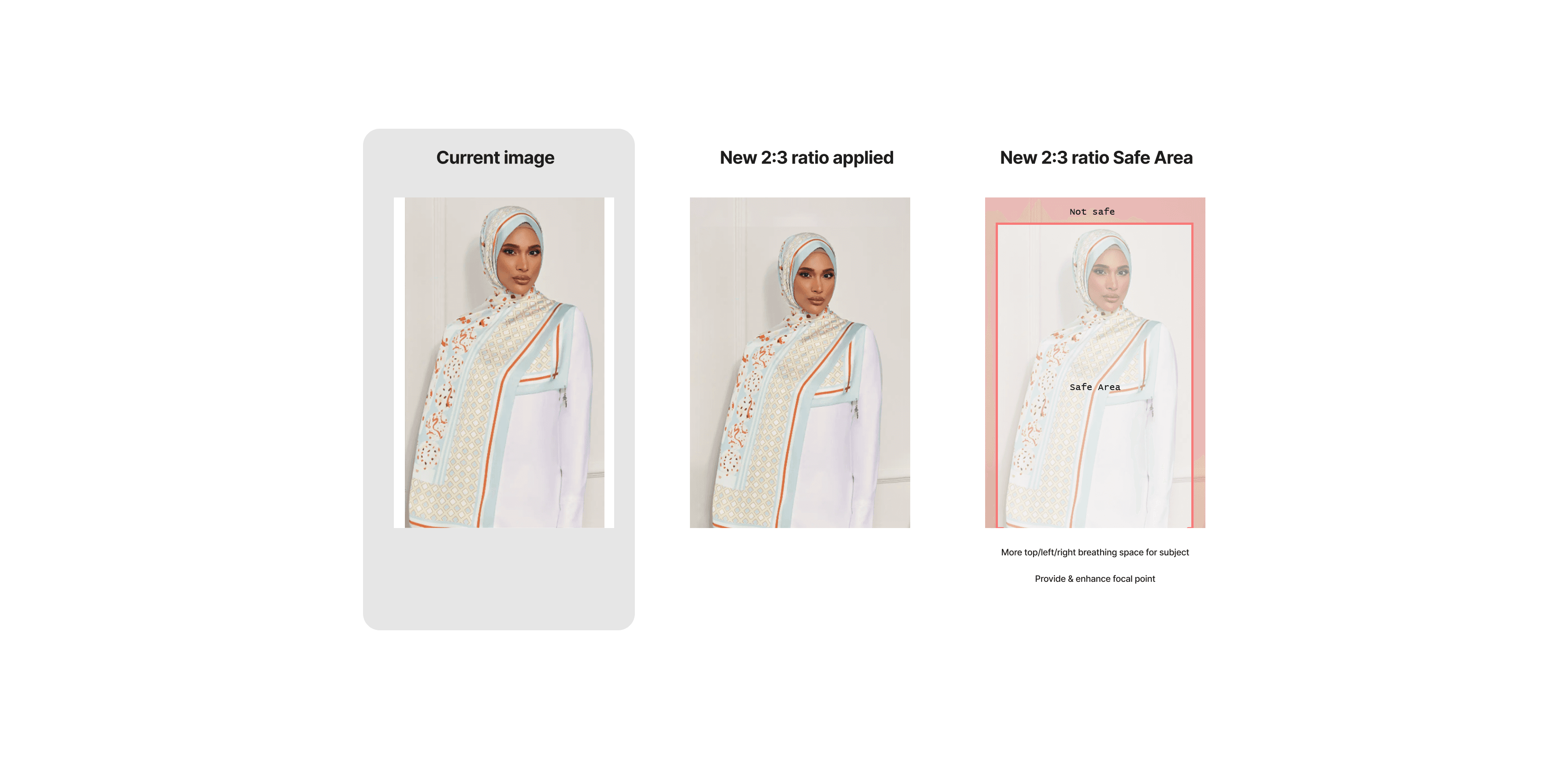
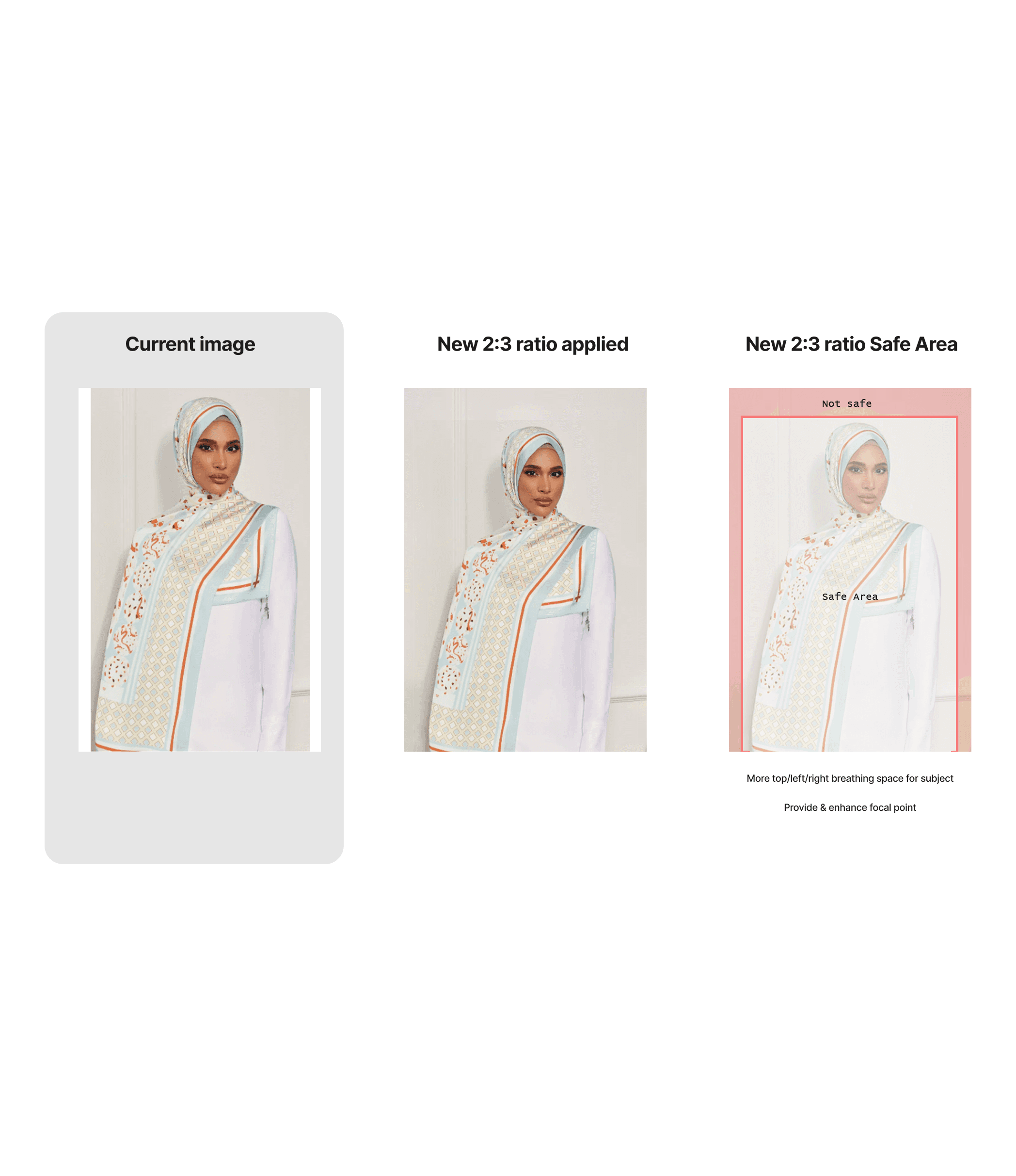
Solution for dUCk App
Make the same ratio on Web and Mobile. So, we need to change the resolution to be 2:3 on the web and on app. The 2:3 resolution are good because customers can view the photos, name and price (with assumptions that we remove the navbar)

Image - Results
Lesson Learned
"We realize that consistency between devices is one of the keys to a good user experience and can make users better understand what products are being sold."
This small step made us realize that there is a lot to be done to make dUCk more accessible and increase sales via mobile app. This small step was one of the triggers for us to redesign dUCk app as a whole.