Welcoming Users the Right Way: Crafting an Effective Onboarding for EZCoordinator
Role
UX Designer
Timeline
1 Nov 2023 - 14 Nov 2023
Product & Platform
EZCoordinator is an essentials real estate tools to help brokers, agent, and real estate coordinator. It helps them to organize transactions, emails, documents, signatures, schedule, and task managements.
The Problem
User Problem - The more time passes, the less effective
Since its initial release (around 2008), EZCoordinator has always provided customer service or agents assigned to help users who first use the platform. Over time, this became less effective.
Project Goal
How might we guide first time users without need of real Customer Service Agent?
Dashboard can be overwhelming for a new users. By adding an onboarding, it helps them to understand navigations, key features, and how to get value from the dashboard quickly.
Without guidance, users may struggle to find the most important insights or actions. Onboarding minimizes confusion and ensures they start using the dashboard effectively.
Research
Desk Research About Onboarding
There are several opportunity for onboarding a new users such as: the signup flow, empty states, splash screens and modals, checklist and progress bars, tooltips and tours, and gamified trials.
Design Exploration
Understanding
Understanding The Flow
Not only understanding the users, I also need to understand the EZCoordinator works. This is to make onboarding easier for me. How can I create onboarding if I don't know the initial stages of real estate agent work, right?
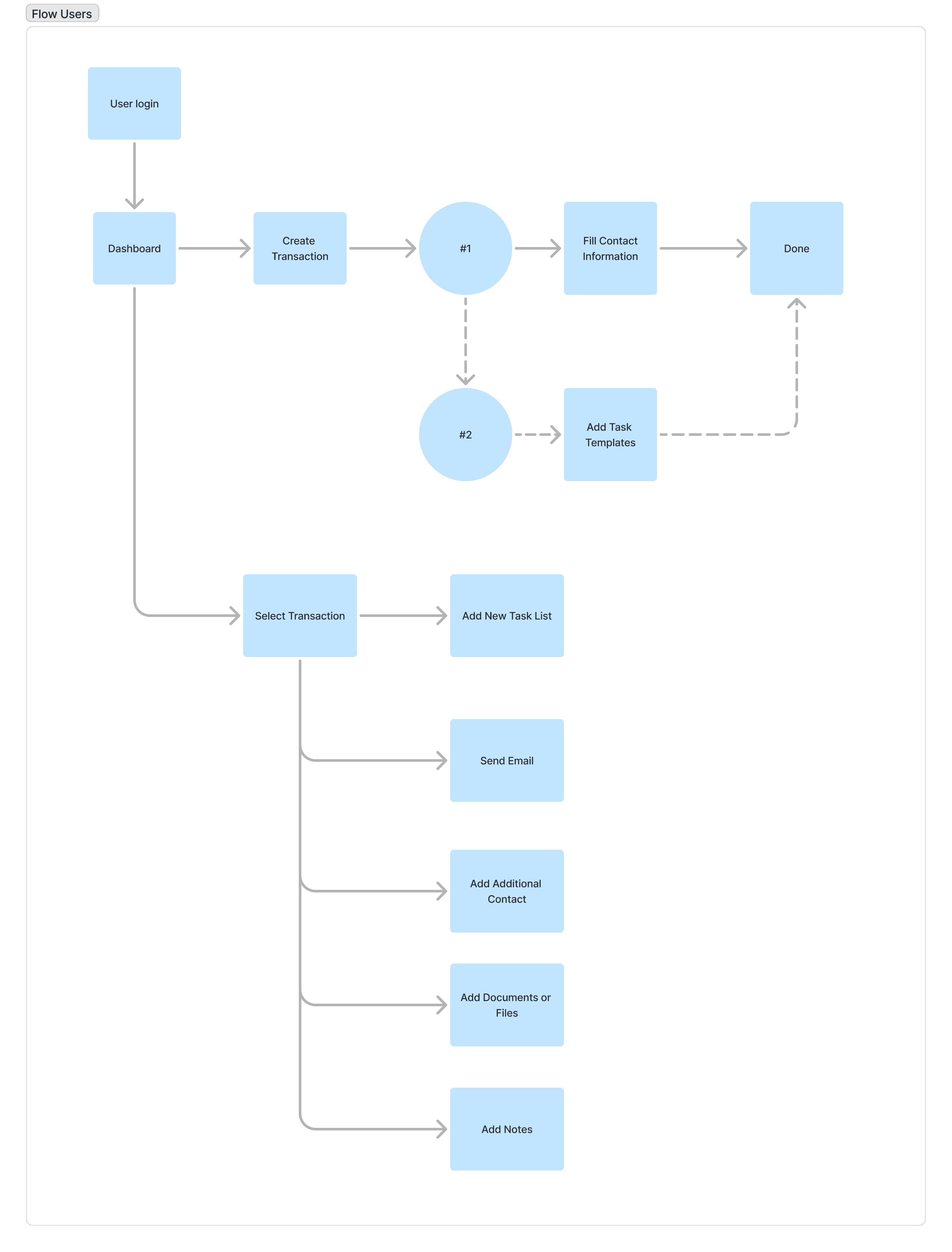
Not forgetting after that I confirmed to stakeholders whether this flow was appropriate? Then, I concluded to make onboarding for
Create New Transaction
Add Task Template
Add New Custom Task Template
Send Email
Add Additional Contact
Add Document and Files
Add Notes
Explore the Design
The stakeholders told us to create a design that could be easily implemented by front-end developers. This is something I'm used to, so I always create several design options, in addition to making stakeholders have a choice of designs if there is one option they don't like, this also helps me to think more creatively. Because “All roads lead to Rome, right?” there are multiple ways to achieve a goal. Based on the desk research I will focusing on Tooltips & Tours, and Checklist & Progress Bar.
Tooltips and Tours
Benefit: This approach can demonstrates the specific product features in details.
Cons: it can be highly irritating, can obstruct the natural flow of the products, and can disrupt user's autonomy.
Checklist and Progress Bars
Benefit: it helps lay out a clear action plan for the user, stays relatively unobtrusive, and is easy to notice.
Cons: if there are too many steps, it might feel overwhelming.
Tooltips and Tours
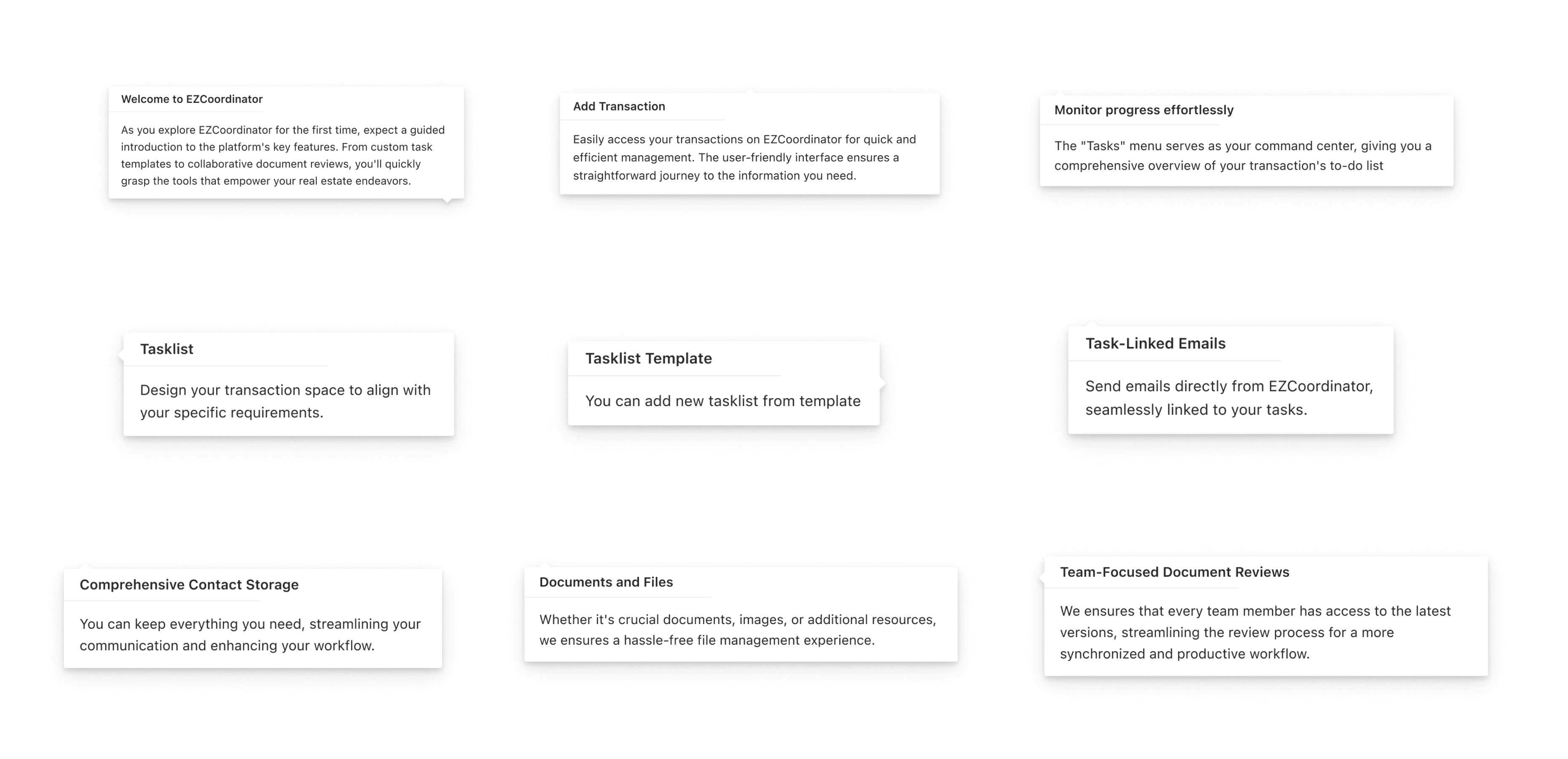
Based on the onboarding flow, I then create a copy for each point.
The Idea for this tooltips is they will be shown after users open the specific page. Example: when users first open the first page after login it will be shown welcome message, when user open Transaction page it will be shown the 'help' description on each feature.


Checklist and Progress Bar
Adding the checklist and we can reuse the tooltips.
With this, users can see the progress of onboarding, this can provide certainty to users, so that they do not guess and do not feel disturbed by the pop-ups that appear. In fact, users can easily choose which onboarding they want to complete first.

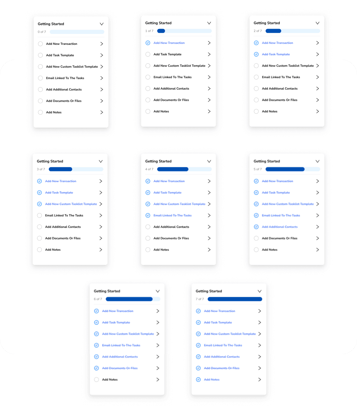

The default options would be with tooltips. It is not using too much screens because it showing a small tooltips to let users know about each features.
"Can you make it more simple?"
After getting a feedback from the stakeholder to make it more simple and letting users know on 'how-to' use the feature more detailed, we create this version by showing video on each onboarding points.
Result
After several feedback from the stakeholder, we decided to go with Checklist and Progress Bar with Video.
Because it doesn't require specific actions to go to the screens, hence it is easier to implement on the front-end side.
Since I developed this portfolio, they haven't proceeded with releasing this onboarding yet.
Lesson Learned
Give more design options to make stakeholder/client more satisfied
From this project, I learned that by giving more design options, it shows that we can maximize the task within limited time and it can help us to be more understand the user problems. By giving more design options, It can also give clients/stakeholders some ideas to solve their problems that they might not have thought of.